



I’m going to point out the navigation items of the legacy web client and show you where their equivalent option is within the Unified Interface. It’s quite a long blog post but, in my defence, there are a lot of screenshots! It’s definitely worth a few minutes of your time.
Firstly, let’s see where we are…
If your Dynamics 365 Customer Engagement navigation menu looks like this:

…then you’re using the legacy web client. In a previous blog post, I mentioned that this is a feature that will, at some point in the future, be switched off and you’ll have to move over to the Unified Interface, which looks like this:

So, let’s have a look at how you can navigate around.
When you’re in the main navigation menu and can see Sales, Service, Marketing, etc.

This can now be accessed in the Unified Interface via the link in the bottom left of the screen.
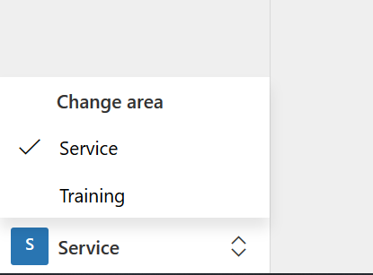
Where you would see Sales, Service, Marketing, etc.
After you’ve selected your area, you’d then select the entity that you wanted. In the legacy web client, these look like:

So you can then get to your dashboards and entities. In the Unified Interface, these links appear on the left hand side of the screen:
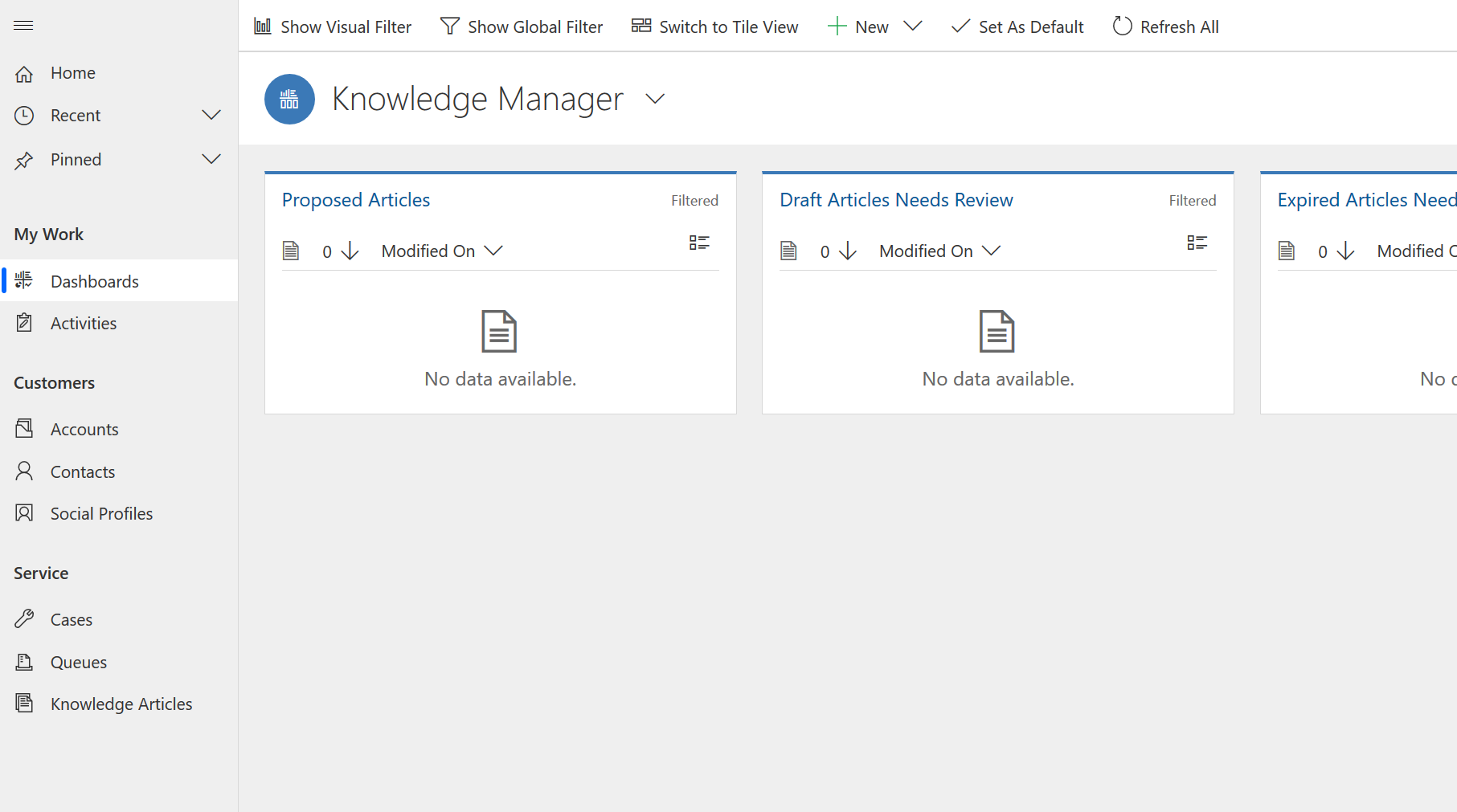
Clicking on these would take you to the same area as the links in the web client. You’ll notice that, in the web client, once you’d selected an entity, the navigation would collapse but, in the Unified Interface, it stays visible with the selected option remaining highlighted (like ‘Dashboards’ above).
Another feature that’s been moved is the Recently Viewed Items. In the web client, clicking on the button below (which would be in the top right of the screen) would show you the recently visited records and views and would also show the pinned items in there as well.
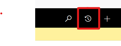
The feature has also moved to the left-hand navigation in the Unified Interface: 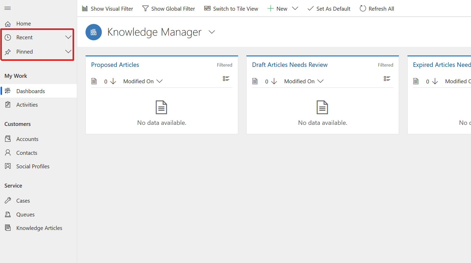
Despite these changes, the New and Advanced Find buttons are still in the same place.
When you click into an entity, the command bar in the web client has not changed that much from:
![]()
To below. You’ll see that there’s a few more options in there and it’s a bit more colourful:
![]()
In the web client, it also used to limit the number of options that were shown (up to 9) despite the amount of screen space that was available with the rest hiding behind the ellipsis (…) on the right hand side of the options as a drop down. In the Unified Interface, a lot more options are visible and it will only show the ellipsis if it runs out of space.
The views that you had available won’t change and they display in a fairly similar way, just making more use of the available screen real estate.
Previously, we’ve seen some shifts in the way that navigation works such as when we went from CRM 2011 to CRM 2013 and also from CRM 2013 to CRM 2015. Compared to these changes we’ve seen in the past, I don’t think that this is anything too radical.
Further down the line, I will also create another blog post to go through ‘form’ changes in the Unified Interface.